Casa Blanka Catering
How can the whole week's menu fit a phone screen with price and number close at hand?
A catering website with a weekly menu, prices and the number for orders, plus a panel in which the company enters the next week's dishes itself.
- Client
- Casa Blanka Catering
- Services
- Websites
- Sector
- Catering
- Website
- salacasablanka.pl
as of September 2026
The situation before
Casa Blanka in Głowno cooks lunches delivered within the town and takes orders by telephone on weekdays, up to a set hour. The menu changes every week, and each day offers two soups and two main courses, which customers combine as they like.
The company commissioned a site that shows the current menu with prices and leads straight to the number on which orders are taken. It wanted to change the next week's menu in-house, without going through a developer and without the risk of new dishes breaking the layout.
We had earlier prepared the company's leaflet with its lunch and catering offer, so the colours, logo and vegetable drawings were already settled in print. The task was to carry them onto the screen and keep the menu comfortable to read on a phone.
Questions the project had to answer
- How can the menu be changed every week in-house, without calling in a developer?
- How can the colours and logo from the leaflet carry onto the screen and stay legible?
Scope of work
- One-page site with the weekly menu and prices
- Panel for changing the menu each week
- Weekday bar that jumps to the chosen day
- Permanent Call button on phones
- Hosting, domain connection and launch
Connected services
- Next.js
- Vercel
How we did it
Menu kept apart from layout
We split the content into what changes each week and what stays put. For the first weeks the menu reached us as a file or a photo and went onto the site once retyped. The panel shortened that route, as the company now enters the dishes in a separate part of the site that needs a login.
It is enough to give the Monday date and two soups and two mains for each of the five days, with side dishes where needed. The site works out the day names and dates from it, so they cannot be mixed up. The panel guides the user step by step, shows which week is live and has a preview button.
Once saved, the new menu shows on the site at the next visit, and a day with no dishes is marked as coming soon. Prices, colours and layout are fixed, so swapping twenty items changes nothing but the menu.
The menu sits in a private file store in the cloud, which keeps the last eight versions. Structured data passes the full weekly menu with dates to search engines and refreshes after every save in the panel.
Legible on a phone
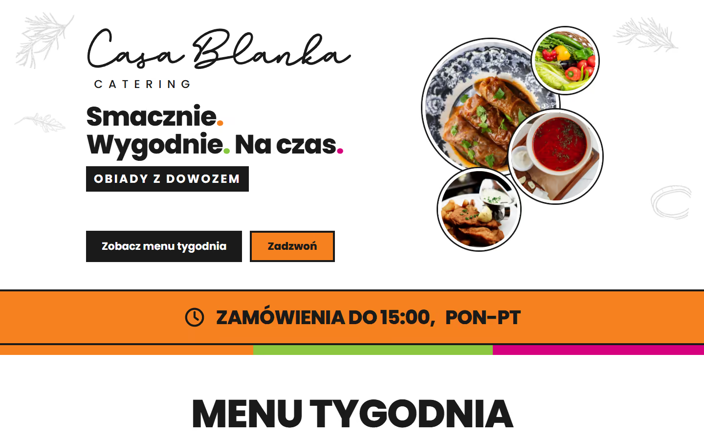
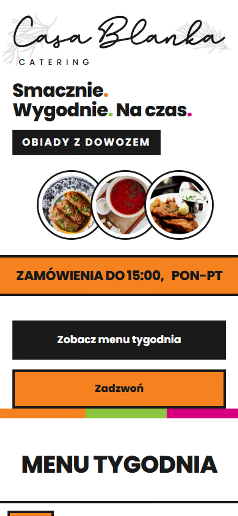
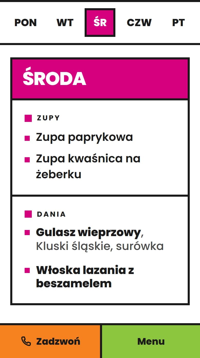
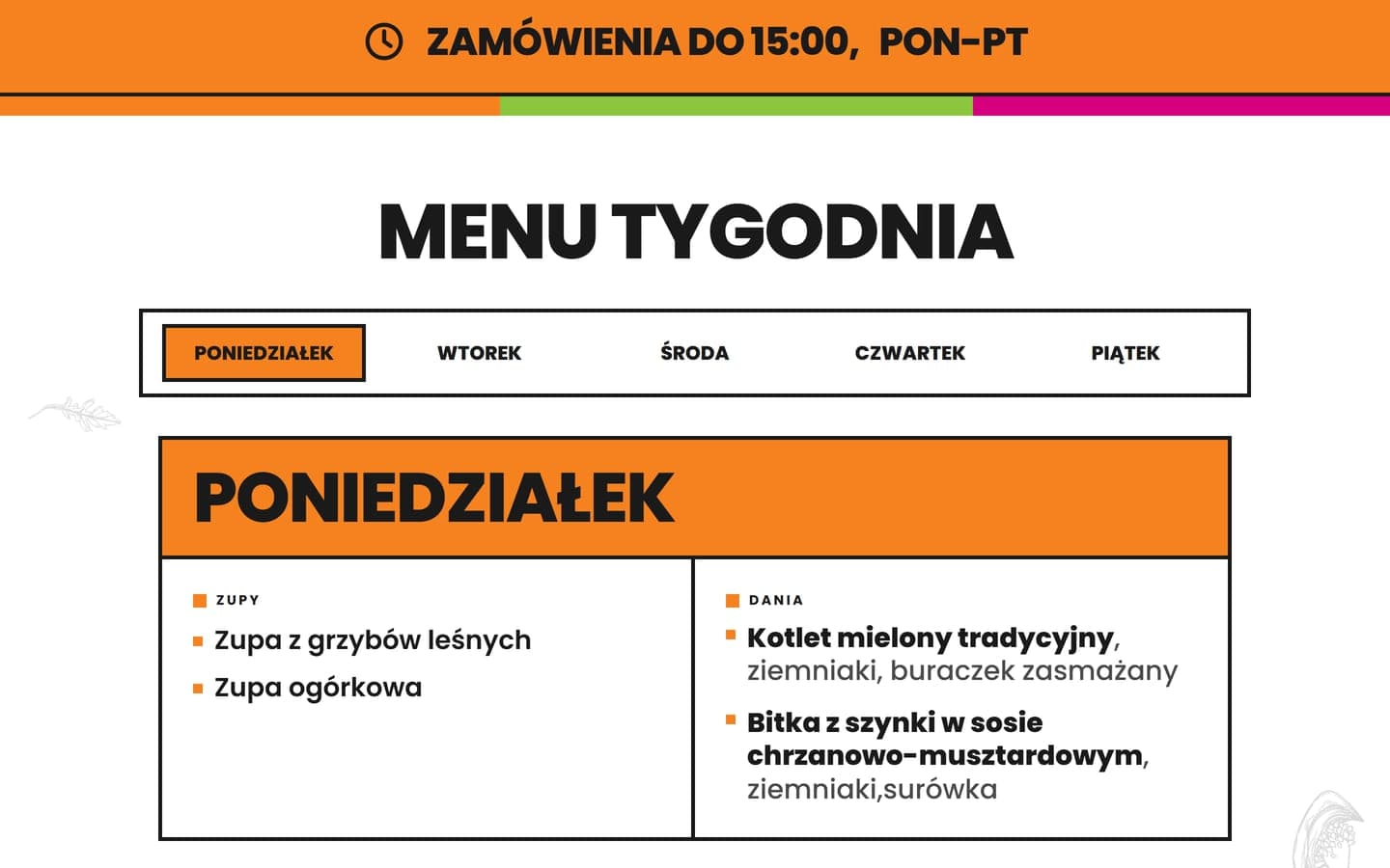
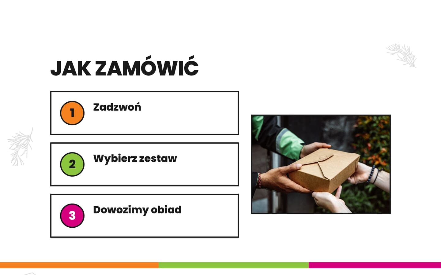
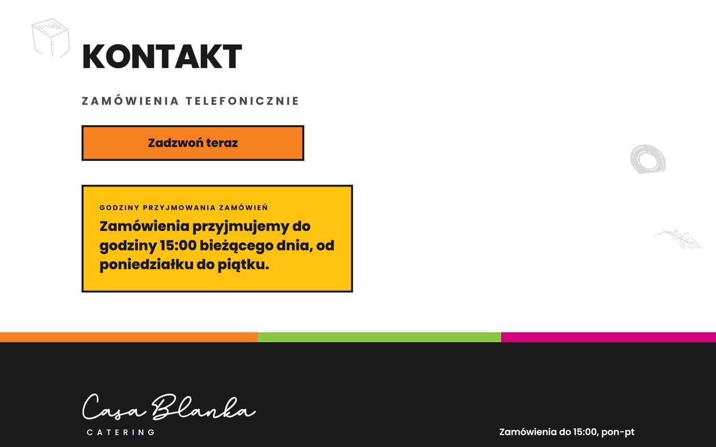
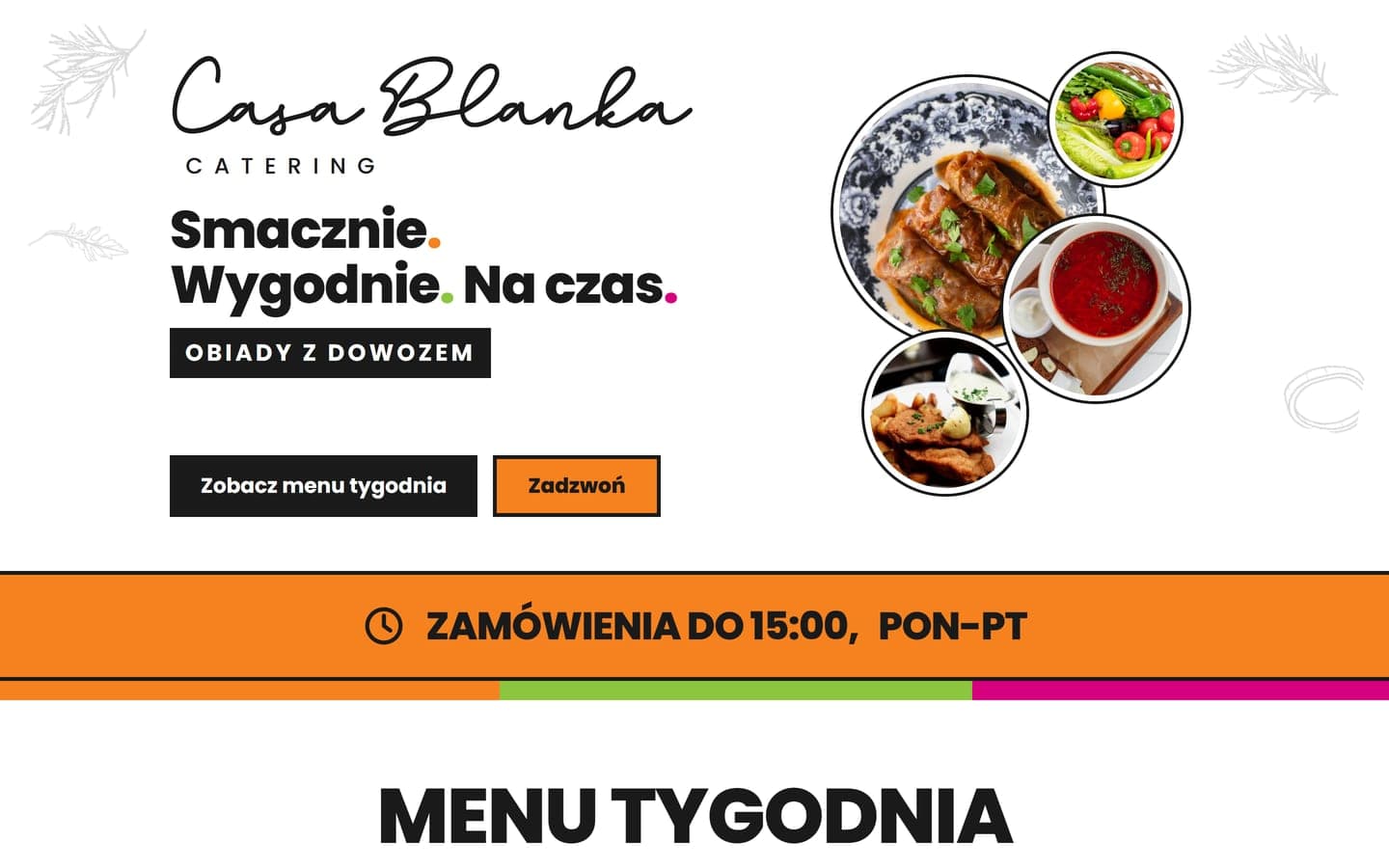
The page leads from the menu to the phone. The first screen shows prices, delivery within Głowno and the order deadline, with buttons to see the weekly menu and to call. Below come the menu, prices with offers for companies, seniors and special occasions, three steps to order and contact details with a large phone number.
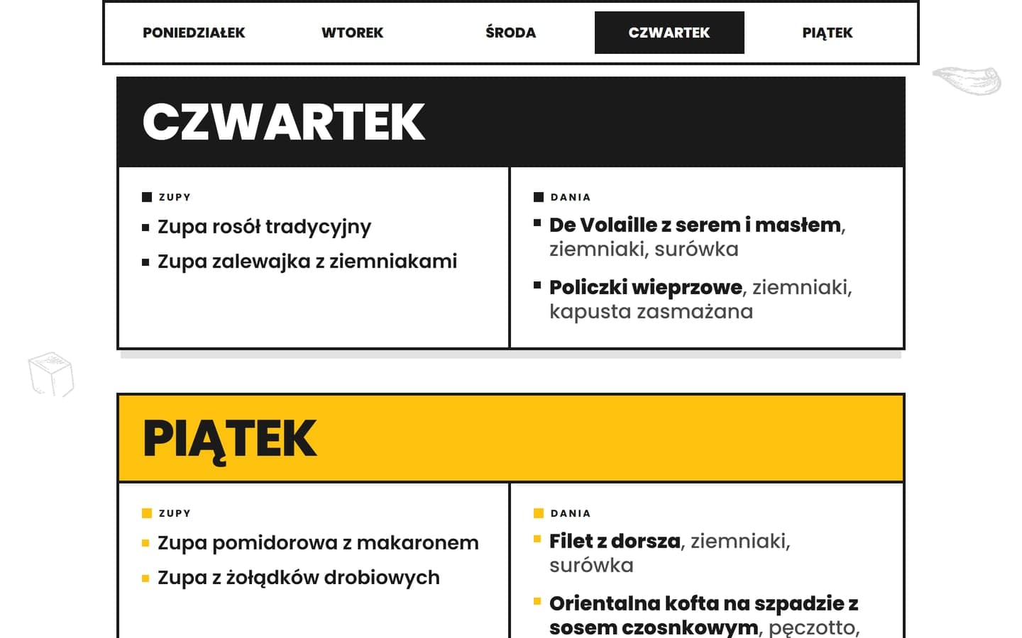
The weekday bar sticks to the top while the menu scrolls. Tapping a day jumps to it, and the day in view lights up in its own colour. Soups and mains stand apart, since customers pair them freely, and dish names are set in a large, clear type.
On phones and tablets a bottom bar with Call and Menu buttons stays visible the whole time, because orders are taken by telephone.
Colours from the company's leaflet
The colours and vegetable drawings come from the leaflet, and we traced the logo as a vector from the company's file, which also gave the site its icon. The brand magenta left white text below the legibility threshold, so on screen it is one shade darker.
Yellow and black joined the three leaflet colours, giving each of the five weekdays a colour of its own, shared by the site and the panel. Eight vegetable drawings sit in the section backgrounds and move gently on scroll, unless animations are switched off in the device settings.
Built with Next.js and hosted by Vercel in Frankfurt, the site sets no cookies and has no analytics or advertising pixels. It therefore needs no consent pop-up, only a short note saying so. The page title and description speak of catering and lunch delivery in Głowno, and the privacy policy and terms have pages of their own.
Selected screens
Planning a similar project? We give the exact price and timeline after a short conversation.
Ask for a quoteNext project
Securand AlertMe
AlertMe subscriptions sell without any office work, from sending documents and payment to the app account, which is set up automatically.